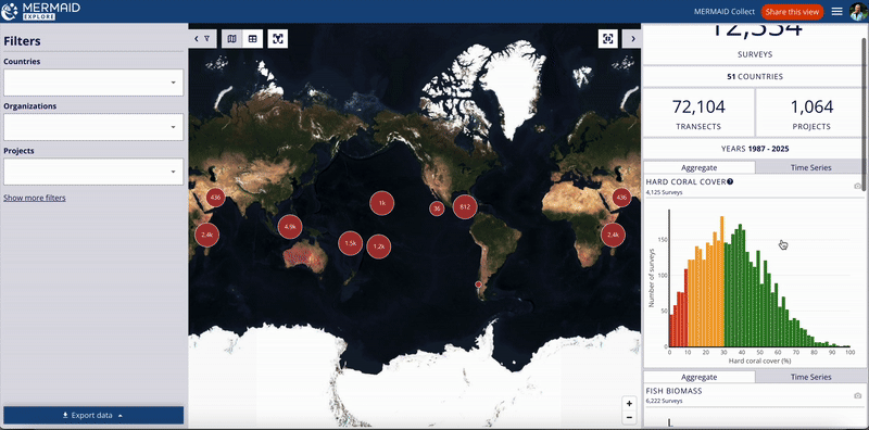
The right-hand panel dynamically shows overall summary metrics and charts based on your applied filters (or map view, if enabled). (Note: For details on a specific site, click its marker on the map as described in Using the Interactive Map).
Overall Metrics: See totals for Surveys, Projects, Countries, Transects, and the Survey Year Range based on your current selection.
Aggregate Charts: These charts show the distribution of all surveys within your current selection (filters/map view) across value ranges or categories for key metrics. They provide a high-level snapshot, including surveys conducted at different times within the same site. Aggregate charts include:
Hard coral cover (%)
Fish biomass (kg/ha)
Bleaching severity (categories)
Habitat complexity score (0-5)
Time Series Charts: These charts specifically show trends over time for key metrics within your current selection, helping you identify changes and patterns. Time series charts include:
Benthic cover (%)
Fish biomass by management regime (kg/ha)
Bleaching severity (categories)
Habitat complexity score (0-5)
Interacting with Charts:
Hover: Move your mouse cursor over bars or points on the charts to see exact values or details. For aggregate charts (histograms), hovering over a bar typically shows the specific value range (bin) it represents (e.g., “bin: 28-29.9%”) and the number of surveys in that range.
Download Image: Click the camera icon (📷) on any chart to download it as a PNG image, ready for use in reports or presentations.
Important: Summary charts are generated based on data shared as Public or Public Summary. Private data is not included in these overall summary visualizations. |